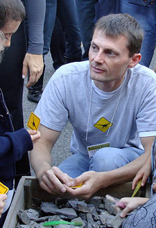
In 2014, Glenn Dryer, Director of the Connecticut College Arboretum, interviewed Richard Kissel, now Director of Public Programs at the Yale Peabody Museum of Natural History, about a permanent exhibition at The Field Museum on the history of life on Earth. Explore excerpts from that interview to find out how they approached incorporating the entire Tree of Life into this exhibit.
- Exhibit summary
- Choosing the trees
- Designing the trees
- Vocabulary choices
- Supporting visitor understanding
- Addressing human evolution
- Recommendations
Exhibit summary
The institution: The Field Museum in Chicago, Illinois, annual visitorship of over 1.2 million.
The exhibit: Evolving Planet is a 27,000 square-foot permanent gallery that opened in 2006. It was developed and designed entirely in-house and is based on The Field Museum’s vast collections. The exhibition stands on its own within the Museum’s galleries: a visitor could come into the Museum, walk through the exhibit, leave, and have a complete experience. It tells the basic story of the history of life on Earth, starting four billion years ago. It is a walk through time up to the present day. The overarching theme of the exhibit is, “all organisms both living and extinct are the result of, and connected by, evolution.”
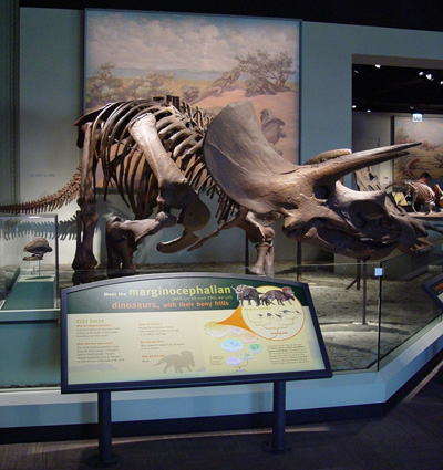
Within the exhibit, every time we introduce an organismal group, it is introduced in a similar manner. In each case, we show the entire tree of life along with a detail showing the tree of that particular group. The hope is that this repeated element will reinforce the concept that all life is connected. At the end of the exhibit, further punctuating that theme is a wall with 100+ circular images of different organisms from the entire spectrum of the tree of life. The signage includes the last line of The Origin of Species, “From so simple a beginning, endless forms most beautiful and most wonderful have been, and are being, evolved.” We liked that concept because trees have physical endpoints, but the quote says “… and are being evolved.” We didn’t want the conclusion of the exhibit to be “evolution is done.” Instead we wanted to give people the perception that evolution is an ongoing process.
Who worked on the exhibit: Scientific advisors, exhibition developers, exhibition designers, the production team, outside artists, internal evaluators, and a project manager to coordinate it all.
Choosing the trees
Each tree in the exhibit features the entire tree of life, together with a detail of the particular group we were talking about. We didn’t want to present isolated trees, such as just synapsids or just reptiles. That’s too Linnaean. The signage explains, “Here is the tree of life, here’s the group we’re talking about, and here’s the origin of the branching point X million years ago.” And looking at the summative evaluation, people did take away the concept that evolution occurs and all living things are connected. Having the repeated elements and repeated trees placed throughout did add up to a unified evolutionary concept that people took away.
When we were developing the larger tree of life for the panels, finding agreement among a dozen researchers was difficult. Driving everything was the idea of “getting it right.” The disagreements came primarily coming from conflicting viewpoints within the literature, and also bias stemming from a researcher’s particular interest. Turtles as reptiles are a perfect example. Are turtles on the parareptile side, or are they diapsids on the eureptile side? If you look at the primary literature, you see these two camps. One of our curators had very strong opinions about turtles being diapsids, so since the exhibit represented Field Museum collections and research, that was the approach that we took. If a particular researcher didn’t have a strong opinion about which way to go when there was a disagreement within the literature, we sank everything into one branching point (a polytomy). A polytomy, while not a detailed treatment of a group’s internal relationships, still communicates the central idea that all of these organisms are related.
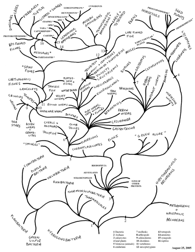
We made a decision only to use the term “species” in the exhibit. We don’t refer to family, order, class, phylum, or kingdom. We took a purely cladistic approach and abandoned Linnaean hierarchies. There are a number of different opinions about, for example, how many kingdoms there are, and we didn’t want to create a boxed-in view that limited us. And it’s my view that higher Linnaean ranks are purely subjective divisions that carry a lot of historical baggage, so it was very freeing to not be confined by those boxes. Some curators were not convinced of this approach, but most embraced it.
Designing the trees
We didn’t want to use the triangular forked approach to the design of trees because, when we used our internal design team for formative evaluation, we found that they would ask, “Well, does that mean that this is more advanced than this over here?” Our developers and designers weren’t phylogenetic systematists, of course, so they had gut-level reactions and were therefore very good at “playing the role” of the visitors. The triangular forked approach led to interpretations of progress: the trees led their eye to the upper right, and everything to the upper right was assumed to be more advanced than everything to the lower left. They didn’t get the notion that you could flip trees around at a particular node and end up with something else in the upper right.

There was also a discussion of whether we wanted to orient the trees left to right, because people read left to right, or bottom to top, since the geologic timescales were represented bottom to top. There weren’t time indications on the trees, but we decided we wanted to make the graphic approach parallel the timescale. Since the geologic timescale was big — an eight-foot graphic panel repeated throughout the exhibition — it pretty much had to be vertical. We flirted a little bit with wrapping the trees in a circle, which you see in some textbooks now, and we showed one to our graphic designers, who predictably said “I have no idea what I’m looking at.”
We settled on the vertical trees in part because of the verticality of the timescale and secondly because that was the design that the graphic designers were most comfortable with. They didn’t like the hard corner approach and rounded it out, to imply a kind of tree shape with natural branching, but without getting too literal with bark and leaves.
Vocabulary choices
We used the term “family tree” in the same labels as “cladogram,” which we defined, of course. We wanted to use certain scientific terms to establish that tree building is a process, a scientific endeavor with a scientific name. To say that a tree is called a “cladogram” is conveying something; to say it’s a drawing showing evolutionary relationships is fine, but use of the term “cladogram” establishes it more strongly as the result of a scientific process. I don’t know if that little bit of psychology worked in the exhibition — we didn’t test if visitors walked out understanding that — but embedding those ideas were important to us.
Focusing on the whole tree of life made our label copy challenging. It’s so easy to say “fish and snails aren’t related,” but in fact everything is related, so we had to come up with relative terms of “distantly related,” “closely related,” etc. You see “x and y aren’t related” in exhibit signage at other museums. That drives me crazy; everything is related if you go back far enough.
Supporting visitor understanding
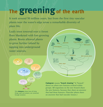
We incorporated some label text that introduced cladograms each time one appeared. For example, here is that text for a sign about vascular plants.
This cladogram shows the branches of the “family tree” connecting all living things. Cladogram means branch drawing. Just as a tree trunk grows and divides into branches, new types of organisms branch off or evolve from their ancestors. The cladogram shows that organisms sharing features share branches. Vascular plants are under one branch because all have vascular tissues.
This text was repeated for each cladogram, with the last line of each sign changed according to the particular group.
We also incorporated 90-second videos, called Evolution Essentials, which are repeated elements and therefore have a very similar appearance throughout the exhibit. The third of these videos is about phylogeny and evolutionary trees. The film basically illustrates how scientists build trees. We anchored that one in the section with the evolution of mammals, since humans are mammals and we wanted to create something that was relatable to visitors. We talked about traits of mammals — the three inner ear bones, hair, specialized dentition, etc. The intent of that video is to show how scientists build trees, support the idea that everything is connected to evolution, and communicate that these trees are representations of how we assemble those connections.
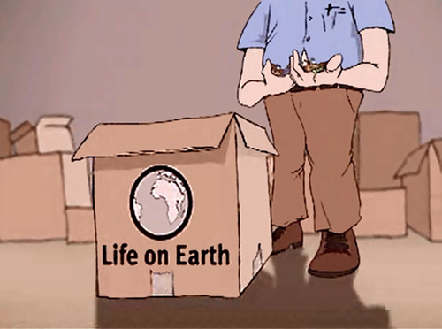
I think the cartoony style that we chose for the videos has a strong attracting power, while the video content was effective in showing that the construction of trees is evidence-based and testable. The style of the illustrator and his sense of humor made the videos far more engaging than a talking head with a scientific grid in the background. Though the hand-drawn approach looks very different from the rest of the exhibit (which has a clean, modern aesthetic to it), the hand-drawn animations made the concept of phylogeny a little bit softer and drew people into it.
I think it worked well that we concentrated on the human connection to other mammals: how humans fit within primates, within mammals, and so on. And connecting the trees to people’s own bodies — the palate on the roof of your mouth goes back to the Triassic, the heel goes back to the late Permian — is a great entry point.
Addressing human evolution
Intelligent design was getting a lot of headlines while the exhibition was being developed, so we wanted to give special consideration to human evolution, since it’s not discussed anywhere else in the Museum. It became a mini-exhibit within the Cenozoic Period, the last third of Evolving Planet. We did a cladogram and had the same initial text as for the other cladograms. One way this cladogram was different, however, is that we were a lot more detailed, as it represented a higher proportion of the species known in the taxonomic group compared to the other cladograms. We also had a timeline on the side of that cladogram, while our other cladograms didn’t.
We wanted to use a very particular study as the basis for our hominid cladogram. Physical anthropology tends not to use cladistics, at least that I’ve encountered. There was this one cladistic analysis that our anthropologist had found, and that’s the one that we used. Based on the tree from that paper, Homo habilis is more in line with the australopithecines, and should probably be called Australopithecus habilis. If you could do a cladistic analysis of these early hominids, probably a lot of the existing names would be thrown out. We decided that we weren’t getting into that level of phylogenetic analysis and phylogenetic taxonomy in the exhibit, and we’d just keep the existing names. That was an interesting case study in thinking about how complex we should get with trees we’d be showing.
Recommendations
I think it would have been nice to get some external feedback from audiences while we were developing the exhibition. It was just a matter of lack of time and staffing that we didn’t go out on the Museum floor and do more of that.
In hindsight, what we did worked well. A key to success was including so much consistent repetition from element to element in dealing with trees. Every time we showed an evolutionary tree, the introductory sentence was the same, and then we just referred to organisms specific to that part of the exhibit. We used the word “cladogram,” having it in bold and defining it every single time. We know that people bounce around exhibits and they don’t often take the path that we plan for them to take, and so you have to treat every display as an isolated piece.
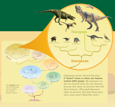
Also important was limiting what we expected people to get out of the exhibit. We made a decision that we just wanted people to understand that living things are connected through evolution, and that we know those connections based on evidence — we don’t just make them up. People weren’t going to walk out of the exhibit talking about synapomorphies or node- versus stem-based trees, nor did we want that to happen. We knew the limitations of what the visitor could realistically walk away with, and we knew very specifically the function of the trees in the exhibit toward that goal. My advice for other institutions would be to figure out what you want to do with the trees in your exhibit. Focus, focus, focus. What is the intent and function of having a tree in a particular place? You’re not going to be able to do it all. You have to pick two or three ideas that you’re going to tell with that tree.
