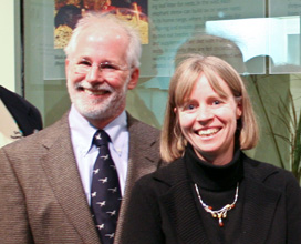
In 2014, Rita Bell, Education Programs Manager at the Monterey Bay Aquarium, and Wendy Shepard, Immersion Program Manager at Omaha’s Henry Doorly Zoo & Aquarium, interviewed Michael Donoghue, Curator of Botany at the Yale Peabody Museum of Natural History (formerly Director of the Yale Peabody Museum), and Jane Pickering, Executive Director of the Harvard Museums of Science and Culture (formerly Director of Public Programs and Deputy Director of the Yale Peabody Museum). Explore excerpts from that interview to find out how a multidisciplinary team approached the content development and design for an entire exhibition about the ways scientists determine and depict phylogenetic relationships, and why people should care.
Exhibition summary
The institution: Yale Peabody Museum of Natural History, New Haven, Connecticut, annual visitorship of 150,000.
The exhibition: Travels in the Great Tree of Life was one of the major outreach products of an NSF grant to enable large-scale phylogenetic reconstructions from data sets containing hundreds of thousands of genetic sequences. The exhibition included a section about the computational complexity of inferring large phylogenetic trees, but the project team decided the exhibition should broadly address the Tree of Life. The 2500-square-foot exhibition, developed in-house by the Yale Peabody Museum and advised by numerous members of the grant project team, was on display for one year. External front-end and summative (but not formative) evaluation was built in; summative report is available online.

Goals for the exhibition: Travels in the Great Tree of Life explored the relationships that connect all living organisms. Its goals were:
- To explain the nature of a phylogenetic relationship, especially the notion of common ancestry
- To convey the monumental scientific challenge of understanding these relationships
- To illustrate the practical uses of Tree of Life research in medicine, agriculture, conservation, etc.
In addition to these broad goals, the exhibition delved into evolutionary convergence and divergence, how characters change along the branches of evolutionary trees, and surprising new results from research on the Tree of Life.
Who worked on the exhibition: A project manager, exhibit staff, education staff, evaluators, a member of the scientific staff, a media adviser, a model maker, a game designer, a filmmaker, animators, and a team of scientific advisors.
Choosing the trees
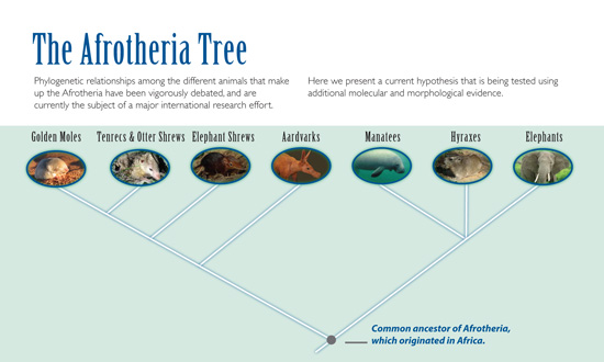
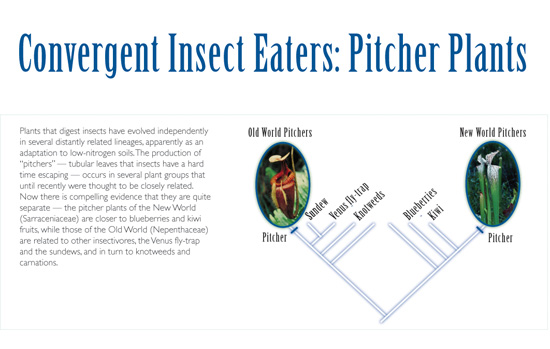
Michael — Trees were the exhibition. Really, it was the goal of the thing from the outset to centralize phylogenies; to have people try and understand how to read and interpret trees. So the exhibition included lots of trees: Afrotheria; trees to accompany two cases about convergent evolution in plants (cacti vs. euphorbs, old world vs. new world pitcher plants); a tree showing the relationship between birds and extinct theropod dinosaurs; trees in an interactive touch-screen game; a simplified human-fungus-plant tree; a 3-D manipulable vertebrate tree; the animated introductory tree; and an animated arthropod tree.
Jane — I think mostly we wanted things that were really cool! Another piece was knowing what research was going on, particularly right here at Yale. And we had the museum collections. And then we had ideas from Michael and other advisors as to what things they had used previously that had been very effective.
Michael — The thing we wanted to accomplish was to surprise people — show them some organism that was cool or that they’re familiar with like the elephant, or like the giant Rafflesia which they may not be familiar with, but is a cool looking organism, and then shock them with some realization like, “Oh, that’s really related to this,” and you wouldn’t have guessed it.
Jane — Then we looked for the sweet spot where that all came together with something like Afrotheria. We knew something about it and had great collections, and we knew this was a case where visitors would say, “Oh, I wouldn’t have thought they were related.” But it wasn’t just about animals, so we included some plants and other taxa.
Michael — We wanted things that were kind of spectacular organisms, like the largest flower in the world, or the Albertosaurus with the hummingbird hanging in its mouth. But we also really struggled with the notion of bringing living organisms into the museum. In the end, to really bring the Afrotheria example to life, we had a pair of live black and rufous giant elephant shrews. If you’re the person managing a project like this, it’s tiring to try to think about how to actually incorporate elephant shrews; where do you even get an elephant shrew, and how would you keep it alive? But I wanted to have living things if we could. The other living part of the exhibit involved the convergent evolution display on succulent plants. We had Euphorbs and cacti and pitcher plants and things like that in a little display case. I think it’s really effective to have living organisms as opposed to all dead stuff.
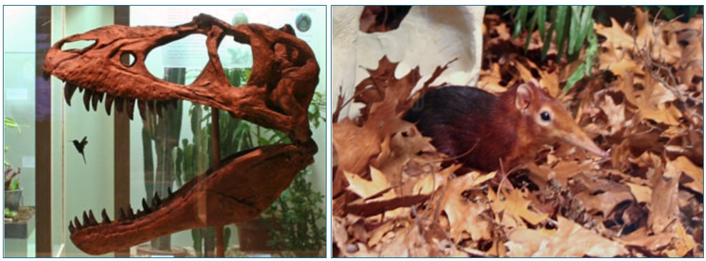
Jane — In the time-tracking studies showing where visitors stopped and read, people clearly liked the living organisms — 82% stopped at the elephant shrews. And while the evaluation showed that the elephant shrews stole the show, it also showed we were very effective in getting the message across about the genetic relationships — what that actually means. We really hit the main goal, and I think it was largely because of the elephant shrews, because people were excited to learn about them, and they then did take that next step to “why were they here?” surrounded by the animals like the aardvark specimen. The summative evaluation showed that the use of specimens did help to illustrate these essentially abstract ideas. However, how to balance using charismatic organisms to interest visitors without overwhelming the educational message is still an open question.
Tree design
Michael — We had a pre-meeting, where we brought people together to talk about such things as the best way to display a tree, how people could go wrong, and what kind of misconceptions they would bring to this when they see it in the first place. At that time, there had been a little bit of research on this; Sam Donovan (currently Research Associate Professor of Science Education, Dept. of Biological Sciences, University of Pittsburgh) had spent some time thinking about how kids viewed trees and had assembled some information about his findings. So we were aware that if you gave kids a list of animals, they would tend to start arranging them in an order, kind of like the ladder of life with one leading to the next. It didn’t come naturally to them to think about phylogenetic relationships. Our front end evaluation supported that. Visitors commonly misinterpreted species arrangement on the tree as a trajectory of progress leading to a supposed human ascendancy as the most evolved species on the tree. So the point is that there is a lot of baggage to overcome to try to get people to think about relationships between species in a different way.
The rendering of the trees was done in house, and we realized early on that we needed a consistent way to display the trees from one section of the exhibit to the next. In a sense, the graphics were largely influenced by me because I draw trees with diagonal branches naturally, and that kind of came into the exhibit. But I’m pretty sure that’s not necessarily the best way to do it.
Jane — The biggest challenge I remember with the issue of tree design was how to deal with things when you’ve got limited space. Because we knew it was a big decision, we spent some time thinking about whether to go with the diagonal tree, the bracket-type tree, or the circular tree, so we looked at all three in the front end evaluation. The front end showed that the diagonal tree and the bracket tree were both equally understandable, but it was crystal clear that the circular tree would be too complicated for people to get their heads around. We thought about circular trees because they’re so space efficient, but in the end went with the diagonally-branched tree.

Michael — But we also wanted people to understand that two trees may look a bit different but can actually be identical in terms of the relationships they depict; we’ve just swiveled the branches. And that idea of swiveling around, wanting to be able to read the trees correctly regardless of the left-to-right order of the organisms at the tips of the branches, would hopefully allow people to recognize in either case, “Oh yeah, fungi and animals are more closely related to each other than either is to plants.”
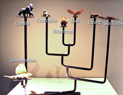
Jane — We also had a conversation about whether we should label the characters that define the nodes. Initially we wanted to put them in, but then we decided not to because they give this impression that it’s about similarity, and we are trying to get them away from that. We decided we just wanted to focus the public on the issue of common ancestry.
We didn’t include a time element on the trees. That was another thing we looked at with the front end evaluation: whether people assume branch lengths hold an element of time. They sort of do — if you make it look like it’s time, then they assume it’s time. And so the only way to avoid that is to do something that looks completely neutral with all distances between nodes being the same length, so that’s what we did. In this case, we made a decision to focus on the primary goal of the exhibit — to explain the notion of the evolutionary relationships. The notion of exactly how far back in time things happened is secondary.
Recommendations
Michael — If we were doing this over again now, there are certain topics that we would probably emphasize more than others. One thing we would probably emphasize more is the temporal aspect that you can include in trees. Sure, we can say “these two are more closely related because they share a more recent common ancestor,” but how long ago was that exactly? We just didn’t emphasize that, and part of the reason is that in 2007 and preceding years, there weren’t a lot of good ways of actually doing that. And the scientists in the room didn’t want to commit, because they know there’s a big confidence interval around that, and how do you get across this uncertainty to an audience in the museum without getting too complicated? But if we did it over today, we would spend more time on that issue of how we determine the absolute ages and how we incorporate fossil information and molecular evidence to make estimates of exactly when something happened in the past.
Also, we developed an animated tree as an introduction to the whole concept of the Tree of Life, but it never turned out quite right. I wanted to be able to fly through the Tree of Life, like you’re on a helicopter or a drone or something, and we never really managed to get that sense. We envisioned that you could start at the bottom, travel along the branches of the tree and come out at any particular tip. It might be a baobab tree over here or a bat over there, and you could see changes along the way. I think it’s a neat image, growing like a plant. I mean it’s pretty cool looking, but it didn’t quite do what we wanted it to. We would work on that more.

Jane — Also, we now have a lot more of the learning research about tree design and tree thinking to help guide the design of the trees and the exhibition in general. There was not a significant difference between diagonal and bracket type trees in our front end evaluation, so it’s interesting that Laura Novick and others’ work has shown that the brackets work better than the diagonals. Their work wasn’t available to us at that time. If we were doing it now, that information would be available, and we might graphically arrange it a little differently.
Editor’s note: Novick et al. (2014) depict and discuss a version of the succulent plant tree from Travels in the Great Tree of Life that was redesigned based on the work favoring brackets over diagonals.

