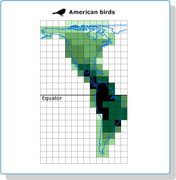
We can look at data on species crowding in many different ways. For example, this map shows the number of bird species found in different parts of the Americas. The darker the square, the more bird species live in the area covered by that square.

Click on the button below to see graphs that show similar data in a different way.
Notice that each graph shows species data over a different area (1000 m2 versus 611,000 km2, for example). And, again, notice that data for both hemispheres are not always available. Nevertheless, if these patterns are typical of most organisms, they can tell us something important about the LDG.
Question 4
A. Based on the evidence presented above, do you think that species are crowded into the tropics or spread out evenly over Earth's surface? Explain how the data above support your thinking.
B. What sort of evidence would it take for you to change your mind about this?
