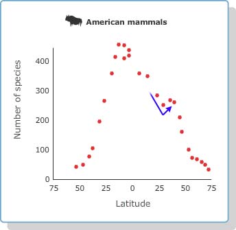
Based on the data we just saw, the LDG appears to be real. Many of the organism groups have a lot of species living in the tropics and far fewer living towards the poles. Even in the cases where we only have data for the northern hemisphere, the evidence we do have fits this pattern.
However, the data we just saw don’t form perfect curves. For example, take a closer look at the graph of mammal species. As you go from 25º north to 35º north, there is actually a slight increase in the number of species found — not a decrease, as the LDG suggests. What does this blip mean?

Question 3
- List at least two explanations for this blip in the graph.
- Should blips like this one cause us to write off the LDG? Why or why not?
