In 2014, Margaret Evans, Associate Research Scientist at the University of Michigan interviewed Teresa MacDonald, Associate Director for Public Programs at the University of Kansas Natural History Museum. Explore excerpts from that interview to find out how an exhibit from the 1950s was updated to reflect our modern, scientific understanding of evolutionary relationships.
Exhibit summary
The institution: University of Kansas Natural History Museum, Lawrence, Kansas, annual visitorship of 50,000.
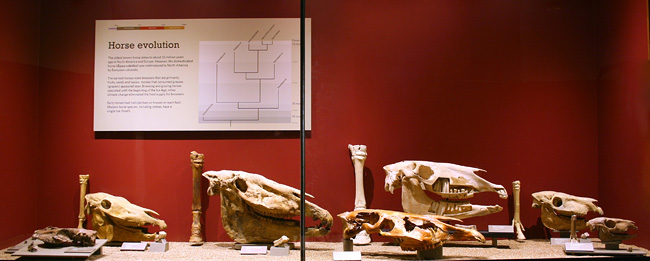
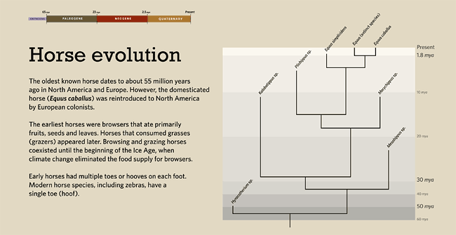
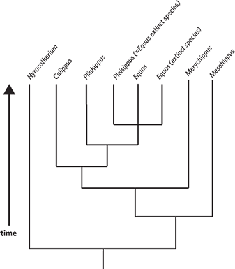
The exhibit: The small permanent exhibit (110- by 24- by 66-inch) represents a 2014 update to a long-standing display that has been in the museum’s fossil gallery since the 1950s. The tree is part of a 42- by 21.5-inch graphic panel at the back of an exhibit case, with the associated fossil and recent material in the foreground. The tree shows the relationships among the taxa represented and uses a calibrated timeline to emphasize the time during which the different taxa lived. This exhibit is located next to a diorama showing scale models of an early relative of horses (Hyracotherium), is surrounded by cases that feature other fossil mammals, and is located in a gallery where several other tree graphics are used.
Goals for the tree:
- To communicate the evolutionary relationships among fossil and extant horses
- To show the diversity of early horses and that different species lived at the same time
- To represent relationships in a way that avoids a linear, progressive interpretation of horse evolution
Who worked on the exhibit: Exhibit staff, education staff, a member of the scientific staff, and a graduate student.
Developing the tree
The general tree design, such as its rectangular shape and the inclusion of a timescale, was informed by prior experience with trees, familiarity with the relevant literature, and my understanding of the kinds of ideas that visitors might have about this exhibit, trees and evolution in general. The selection of specimens and layout in the exhibit was informed by the goals of the exhibit and final tree design.
The exhibit plan was to use the existing space with most of the same material and present a basic, but scientifically accurate and educationally appropriate, depiction of horse evolution. This was probably our oldest exhibit in this gallery, dating from the 50s. Originally, it showed a slow, straightforward, linear progression, a common stereotype of horse evolution, which is inaccurate from a scientific perspective and problematic from an educational perspective as it reinforces incorrect intuitive interpretations about evolution.
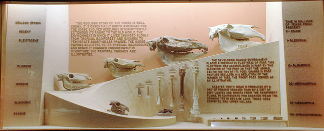
For all design decisions, we actively tried to avoid reinforcing the common linear misconception about evolution, the idea of one thing turning into another. The project team talked about available taxa and what we wanted to show such as including historically contemporary taxa and making the depiction of evolution non-linear. We increased the number of taxa from six to eight, swapped out casts for real material where possible, and included multiple body parts where possible (skull, tooth, and foot), which we grouped by taxon rather than by body part (as in the original exhibit) to avoid a linear depiction. We also replaced one taxon for another to show two genera that lived at the same time and that were different from each other in terms of size, etc., to get away from the idea that one thing turned into another.
Educators and scientists then created a tree diagram to show the relationships among the selected taxa. They used a rectangular format and changed the taxa layout in keeping with best practices. The display of specimens in the exhibit follows the layout of the tree. Once we knew the phylogeny, we rotated nodes so that we did not go from all the small taxa to the medium to large in any way, and made a point to not have the extant horse on the far right. The idea was that if you look at different points, you should see that there’s a small one over here, there’s a small one over here, and there’s a large one here. It’s not a progression. We specifically tried to lay them out in a way that would not reinforce the idea of linear evolution from one thing into another or that it was a transition or transformation from small to big.
Modifying the design
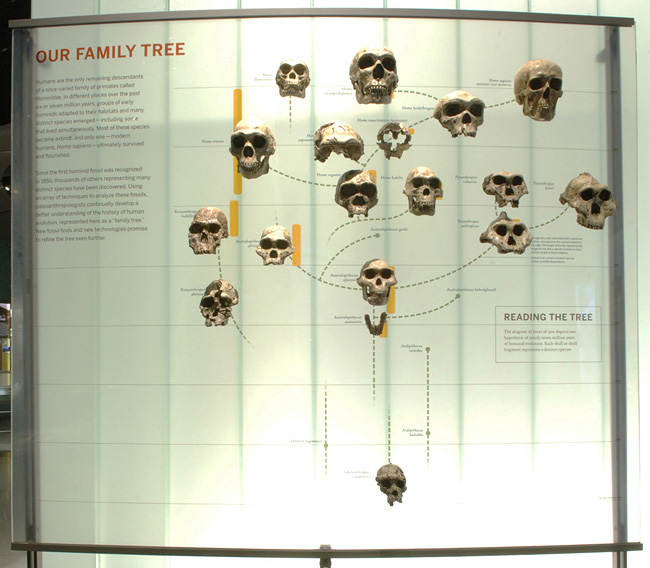
When we originally created the tree, all the taxa had terminal endpoints at the same level, and there was a time arrow to give people some sense of time, which is what we have for our other tree graphics in the museum. As a group we got together to review the phylogeny in terms of whether it was accurate, and it became clear during our conversations with the scientists that they thought it was important to convey how diverse horses were through time and that different horses lived at the same time. So we created another version of the tree that emphasizes time more explicitly. I thought back to the hominid graphic from the Understanding the Tree of Life project and the associated paper, and the potential value of showing that things within the same taxon lived at different times to emphasize diversity — so we redesigned it to create this calibrated tree of horses in which taxa exist at different time points and in which different time periods are highlighted.
No formative evaluation was done for this particular exhibit, but we had done some very informal trial testing with a few other tree graphics that were being developing for associated exhibits on the same floor. We threw up a couple of tree diagrams with post-its and asked visitors what they thought it was about — really just to see how well a simplified tree graphic was at communicating about evolutionary relatedness. Visitors responded ‘I think this is about evolution’ or ‘I think this is about relationships,’ so we concluded that even simple tree graphics can help cue visitors to think about evolution.
Recommendations
If they could do it again: If we had the space, it would be great to include more specimens to show a greater diversity of historically contemporary taxa. It would also be great to do some evaluation to compare the previous and updated exhibit. Also, adding a sentence explaining what the tree is showing might have been helpful, or perhaps we could have just added a label that says ‘evolutionary relationship of horses.’
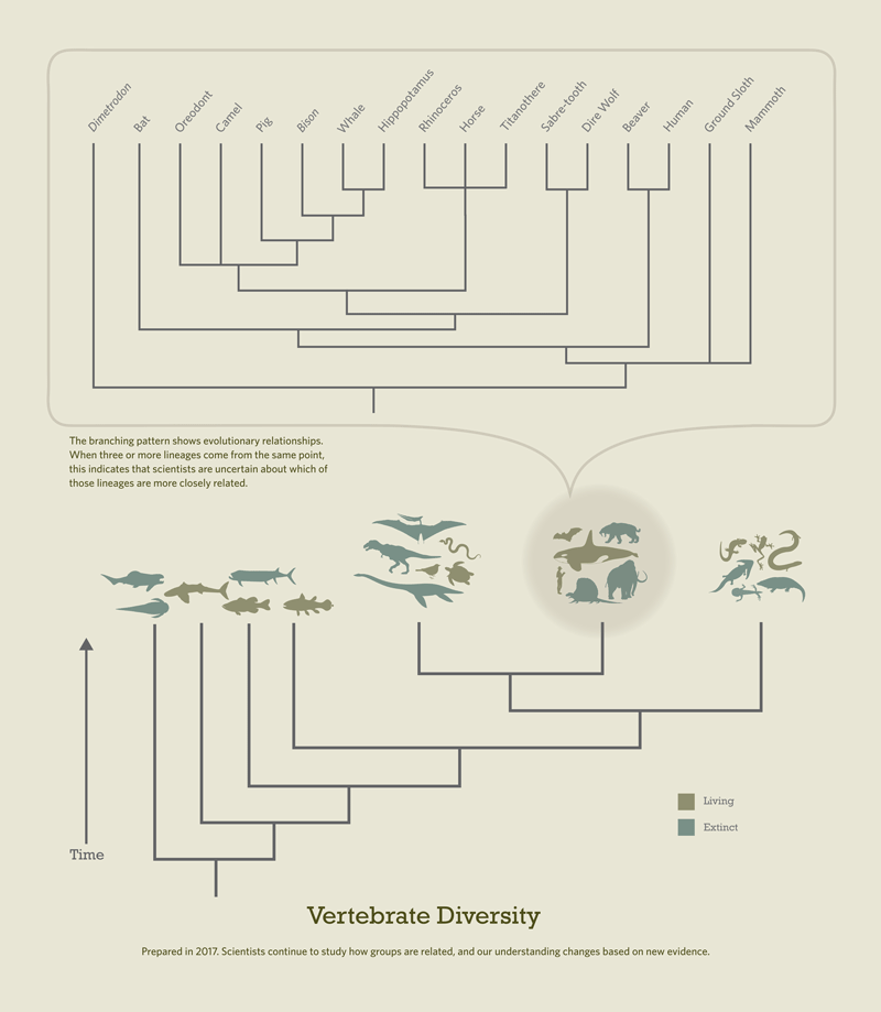
There are other trees in this gallery and on other floors in the museum that provide a broader context for this exhibit, and we wanted to draw on that. Moving forward, we will be looking for other ways to make links between specific exhibits and the broader tree of life. For example, we have a vertebrate tree with the branch belonging to reptiles expanded to show detail within that lineage on display. Recently, the overall vertebrate tree graphic was repurposed in another section of the gallery and includes horses in the context of an expanded mammal branch, along with humans and other taxa.
Advice for other institutions: Think about your message and about why you are including trees. Get many people involved in the tree development process: you need to include perspectives from education, exhibits, and the scientific end of things. Be able and prepared to explain the decisions about what you do and what you don’t do with your trees. Also, be prepared to backtrack and revisit things; it is OK to change the message and the tree. Having someone who keeps the discussion focused on why you are using a tree — someone who revisits the educational goal and message throughout the process and who can serve as the final arbitrator on these issues — is important.
I recommend considering the tree within the context of the museum overall — how it relates to other existing exhibits or planned ones, and if or how they might need to coordinate or relate. It is also valuable to consider potential ways to supplement the visitor experience to make additional connections to trees or provide more information to different audiences. For example, you could incorporate tree-related activities as part of gallery or exhibit guides or as part of pre- or post-visit curriculum material.
Check out the tree-related activities that Teresa uses to enhance visitor experience beyond the material in the gallery itself:

